The Challenge
ATG Entertainment were launching their first app, ATG Tickets, while updating the web experience to align with it. Having relied purely on their website and in-person box offices for sales and brand awareness, the company were up against multiple ticketing apps and aggregators that were leading the market. They needed to implement a defined content strategy and ensure consistent, intuitive content design across 5 squads and 5 countries to enter as a strong challenger.
User research was at the heart of the project and having identified 4-5 varied personas, the user experience and design needed to accommodate them all. Additionally, to give confidence to the roadmap, a Content Design Style Guide needed to be built and maintained as iterations and more research took place before and after MVP launch.
The Solution
Design content for all user journeys that meets both the ATG brand and product goals.
Demonstrate via live files and collaborations how a strong content strategy brings cohesiveness and efficiency to the product design process and result.
Define content rules in a style guide so there is no room for error or inconsistency moving forwards - whether for new products or localisation.
Hold workshops with senior stakeholders to get more buy-in and understanding of the content strategy as the product progresses and grows.
The Process
Arriving in the Beta phase, my first step was to define and present my own roadmap for content including content drafts on designs, facilitating workshops for leadership, legal, product, engineering and hospitality and handover according the product timeline.
Close collaboration through team and individual meetings kicked off and became the standard for us to work through all the new and existing user flows to understand context and user research before presenting changes and options.
All agreed changes were documented into my newly built Content Design guide as the company’s first single source of truth for content. I maintained this throughout my contract and it was used as the basis for localisation operations for Germany, Spain and Austria which I led.
A side project was also starting for an aggregator platform, which required more branding and tone of voice differentiation to the core product. The business looked to me for more creativity, user research engagement and experimentation for content design in the pre-Alpha stage.
The Result
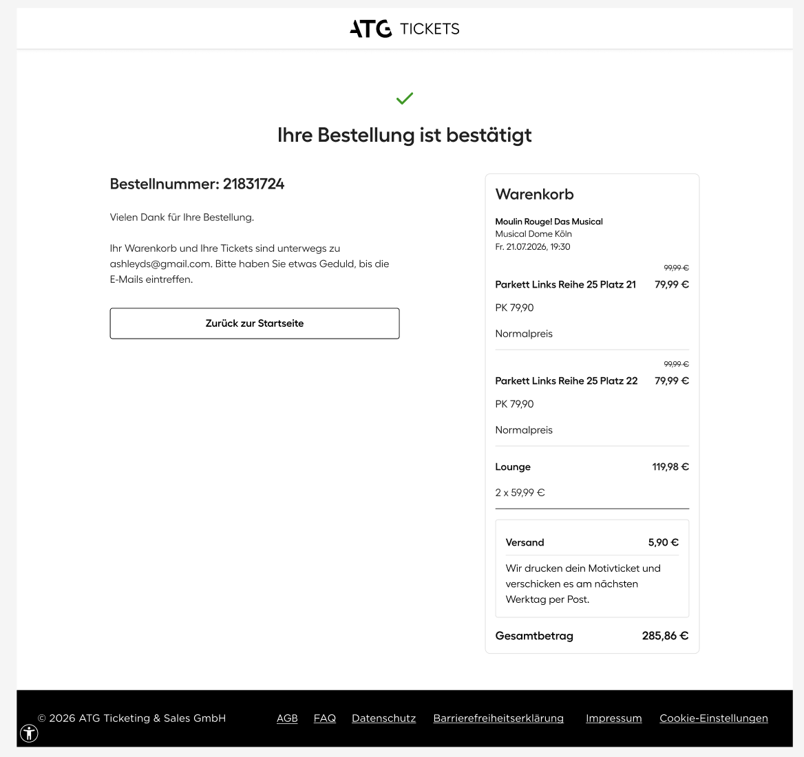
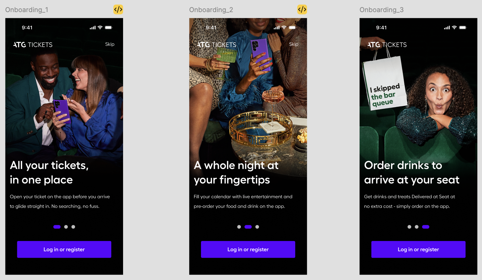
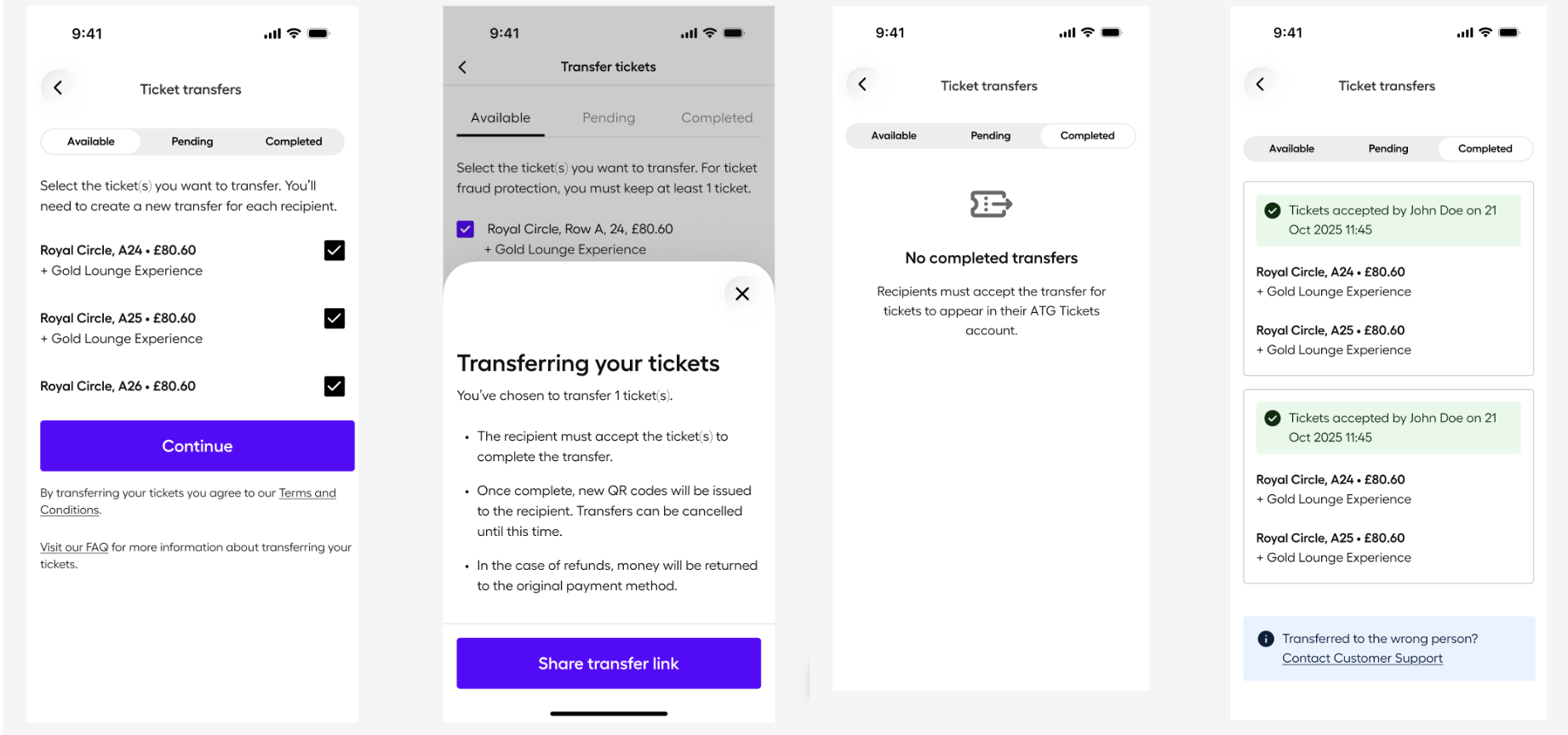
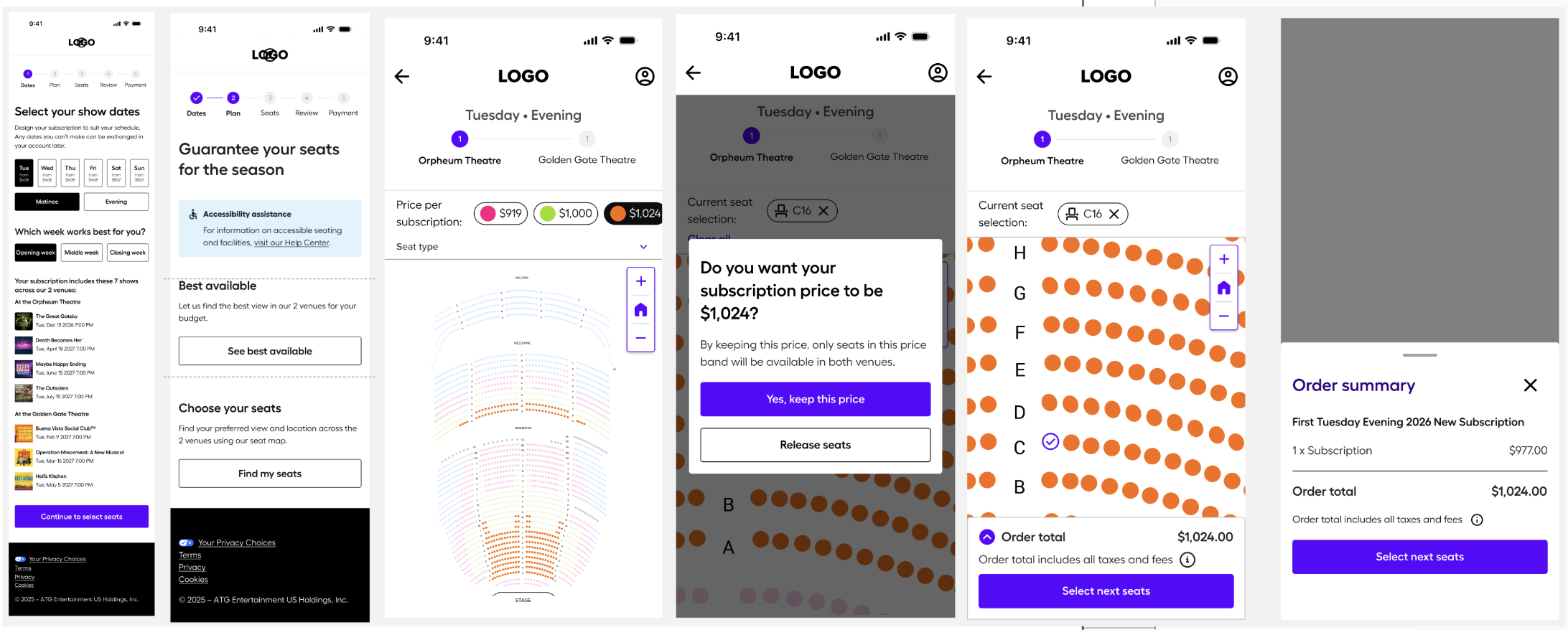
Onboarding & Other Key User Flows
Concise, clear and accessible content that remains consistent on app and web, bringing together the ATG brand with logical and intuitive user-centred design.
For some products, like Subscriptions, live user research showed confusion after launch and required several iterations to remove this. Customer Service engagement for this product reduced by 15%.
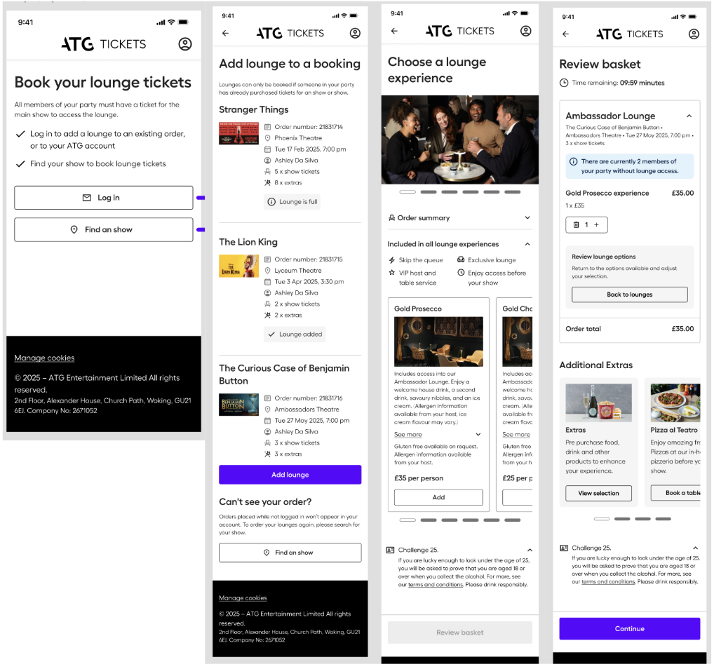
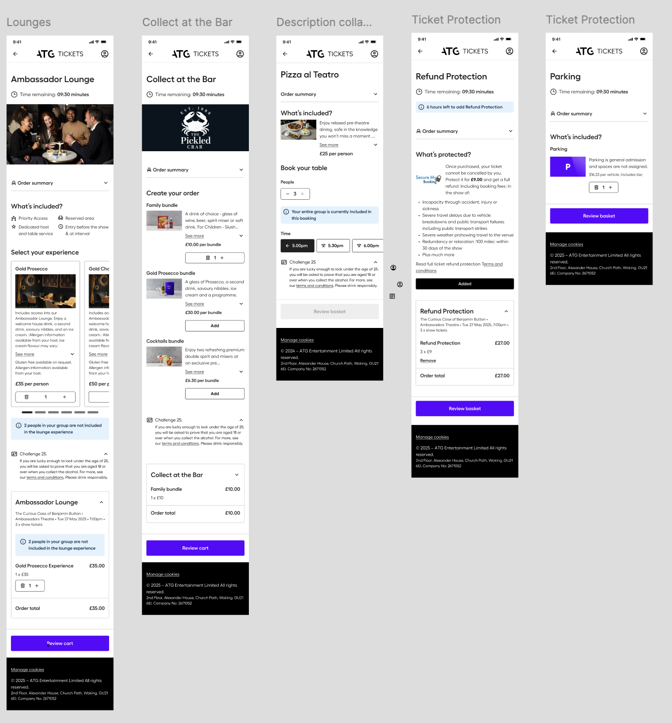
Information Hierarchy & Font Hierarchy
Standalone Upsells selection screens became uniform in its hierarchy allowing for a predictable experience for users.
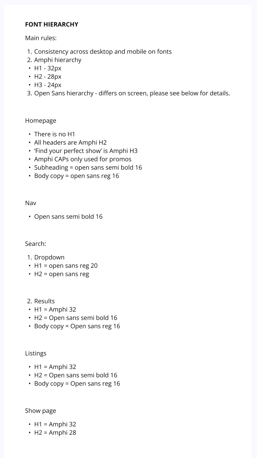
From early build stage, the side project had no consistent font hierarchy. After taking a holistic view and reiterating content design alongside the DS lead and Head of UX, a hierarchy was defined for each user screen.
Branding and Tone of Voice Differentiation
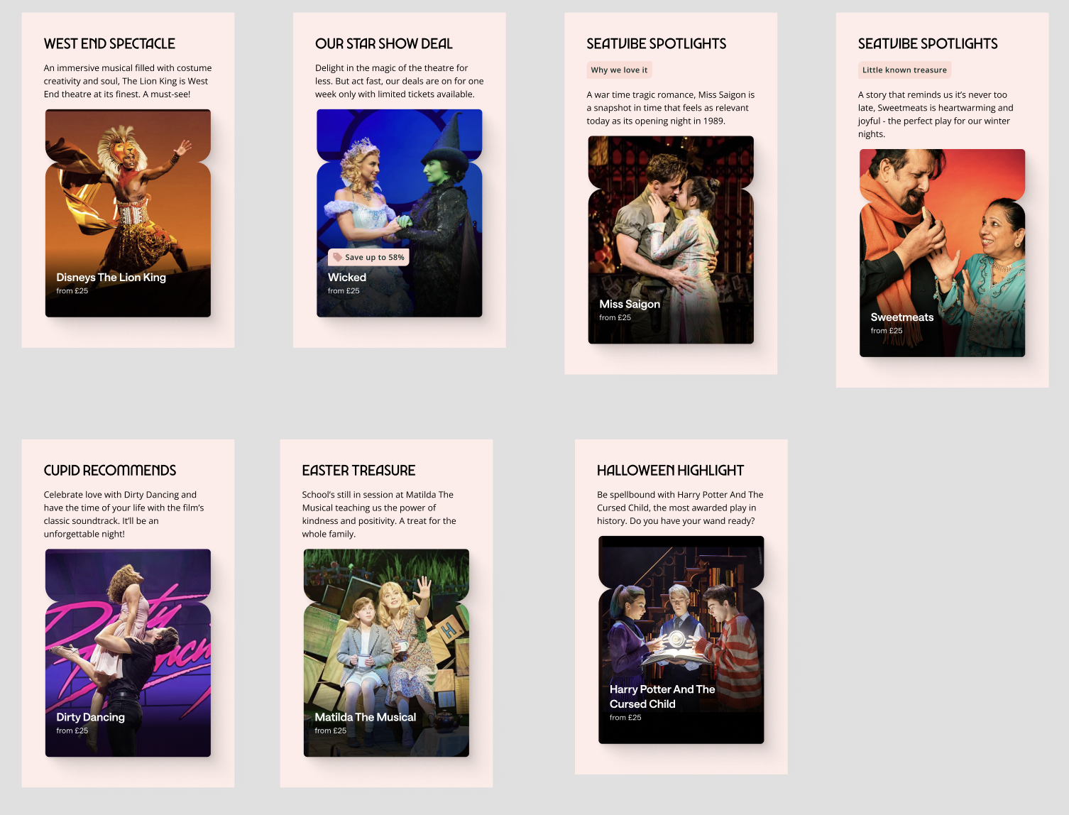
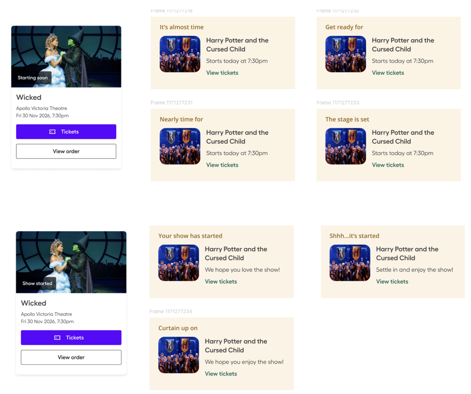
Presenting a variety of options to demonstrate how a new tone of voice could be applied to specific points in the journey to boost the brand.
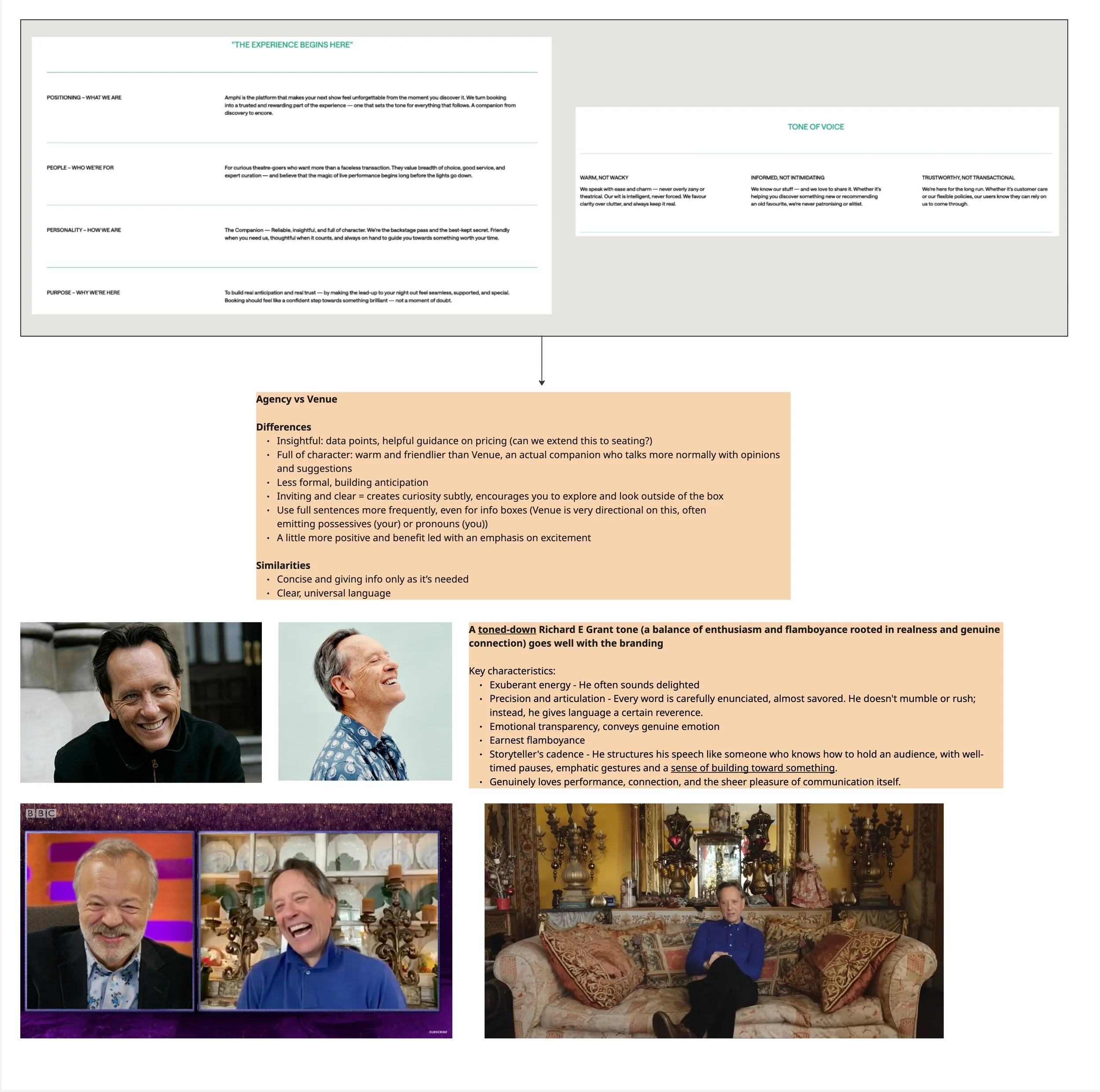
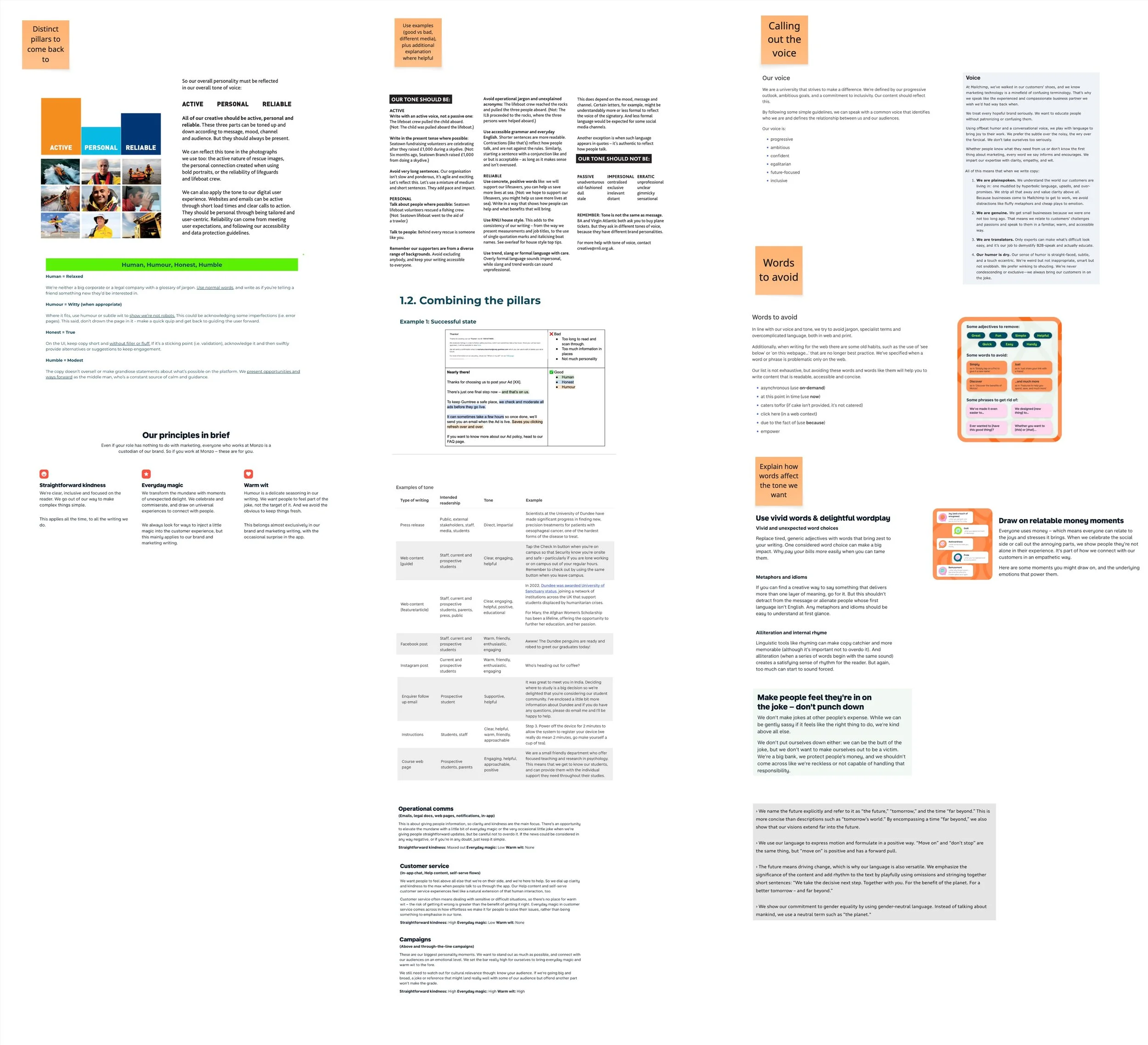
Provided the external branding agency a starting point on the voice of a new product having been involved in early stage design. After presenting their ToV deck, I collated different examples of fuller guidelines specifying the gaps and bullet points we needed to be included.
Style Guide Localisation
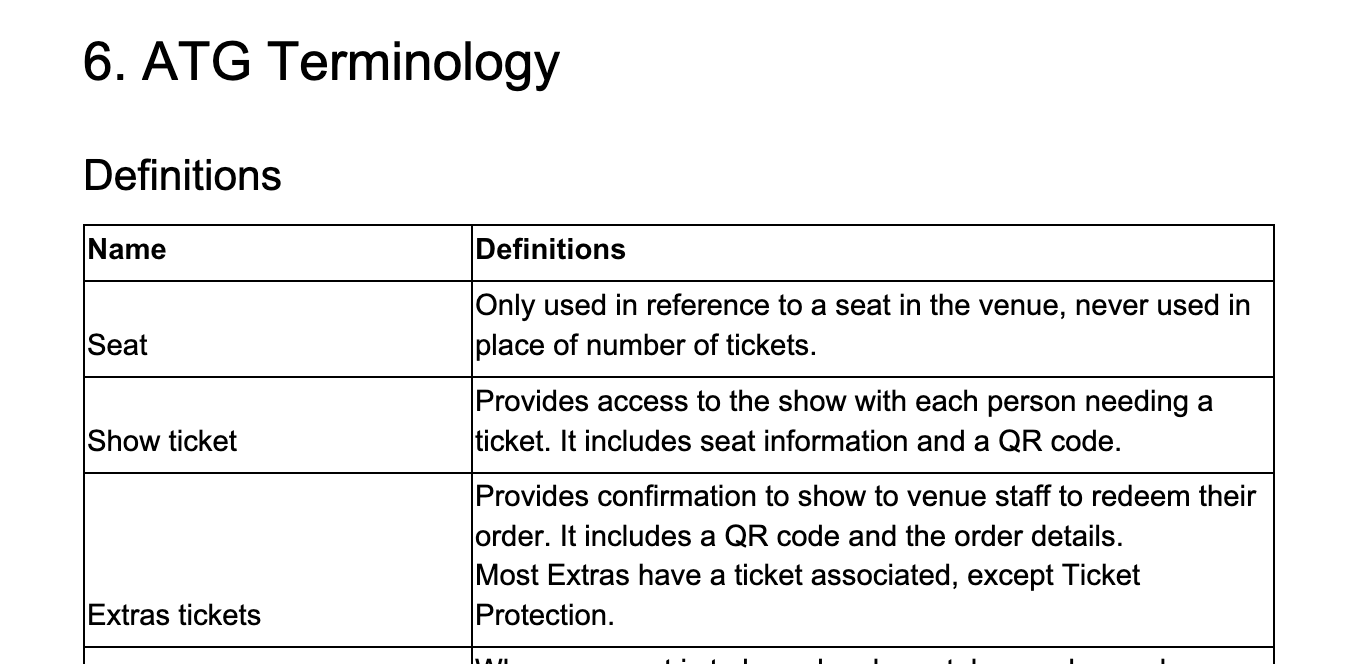
An agreed single source of truth for the design and product teams to reference for Content Design Principles, microcopy, grammar, formatting and glossary.
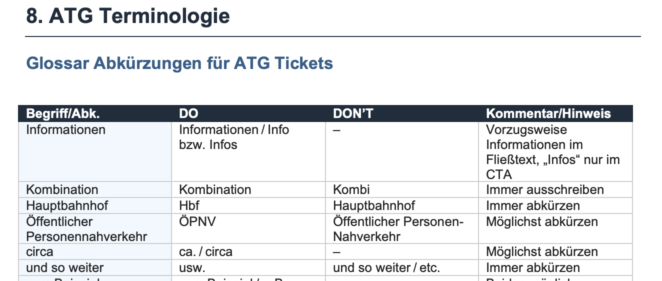
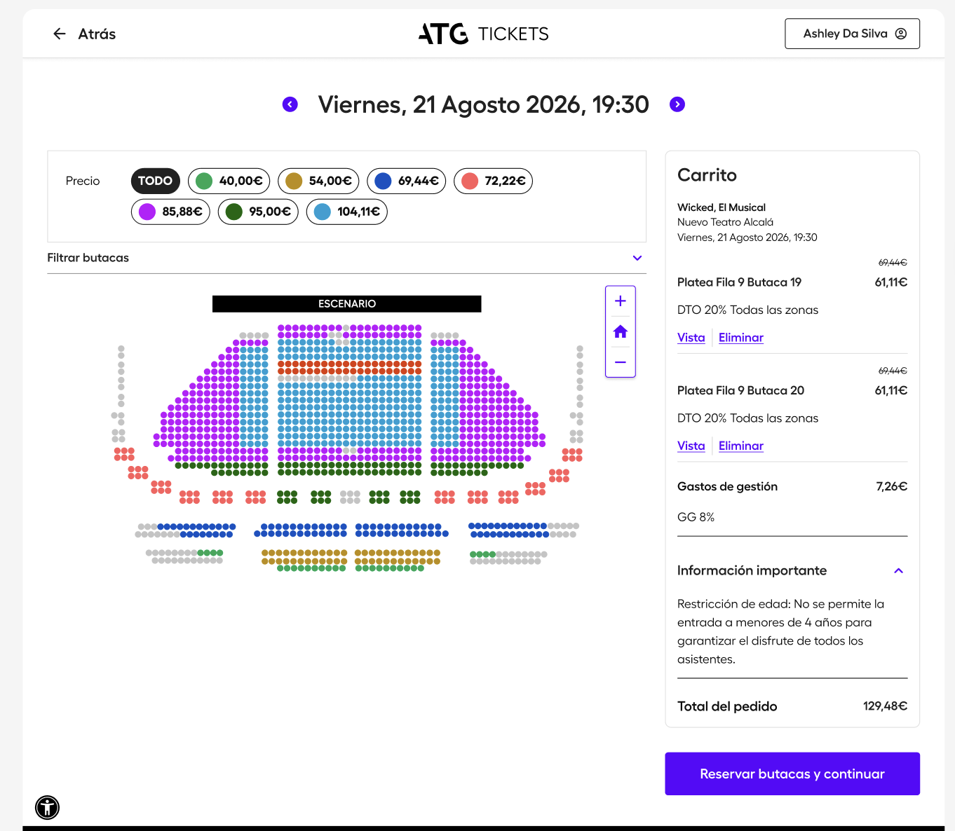
The original was also used for the localisation projects for US, Spain, Germany and Austria which I led with the global teams and involved localisation copywriter contractors. Using the relevant regional documents and individual projects in Claude I set up, designers re-created key user flows and screens using Tolgee alongside Figma.